A few weeks ago, I received an email from an architect/interior designer who had worked on a showcase house that was now open to visitors. “Would I like to come see it?” Need you ask? Maria Tracy, the very talented designer behind the house, explained that she had seen “The Octagon House” write up in Cote de Texas and thought I would like her showcase house just as much. So, with camera in tow, I ventured outside the loop – a rarity for me these days – to the wilds of Memorial, one of Houston’s prettiest neighborhoods. I actually grew up in Memorial (having moved there after our stint in glamorous Galena Park!) so I have great affection for the area. It’s an extremely wooded part of town and many of the area’s streets are without sidewalks or curbs. Some parts of Memorial are very rustic and charming, others are more typical suburbia. The Buffalo Bayou winds it way throughout Memorial, it’s fertile banks the cause of all the lush greenery that distinguishes this part of Houston - towering pine trees, live oaks, ivy and mosquitoes too, to be sure, are plentiful. But still – pesky bugs aren’t reason enough to not live here, in truth it’s heaven on earth. For a girl who lives in the inner city on a tiny plot of land, the huge Memorial lots with wooded acreage are extra appealing.
The trek to Memorial ended up to be worth it. The showcase house was everything Maria Tracy promised it would be, and much, much more. With Tracy behind it, I’m not surprised. Her resume is quite impressive - a degree in architecture is praise worthy enough, but she actually possesses a masters. She is also a registered Interior Designer and today, she favors that side of the business. On her web site, Tracy states that John Saladino is her “patron saint” – more clues that I would feel right at home in her showcase. Tracy’s forte is incorporating the extra touches that make a house special, and her cabinetry design is certainly one of her most outstanding contributions here. She also is extremely interested in tile design, and as you will see – tile plays a very important part in the showcase’s decor. The house was built by Ben Crawford, who owns Crawford Renovation, a top rated builder in the area. Detailed floor plans are provided below. Enjoy!
Walking into the English Tudor styled house, the eye is drawn past the center stairway, all the way through to the back yard. The floors are dark, wide planked hardwoods.
To the immediate left is a gallery with a groin vaulted ceiling that runs along the front of the house - past the living room - on to the dining room. Antique tile from France forms “rugs” inset diagonally into the wood floor.
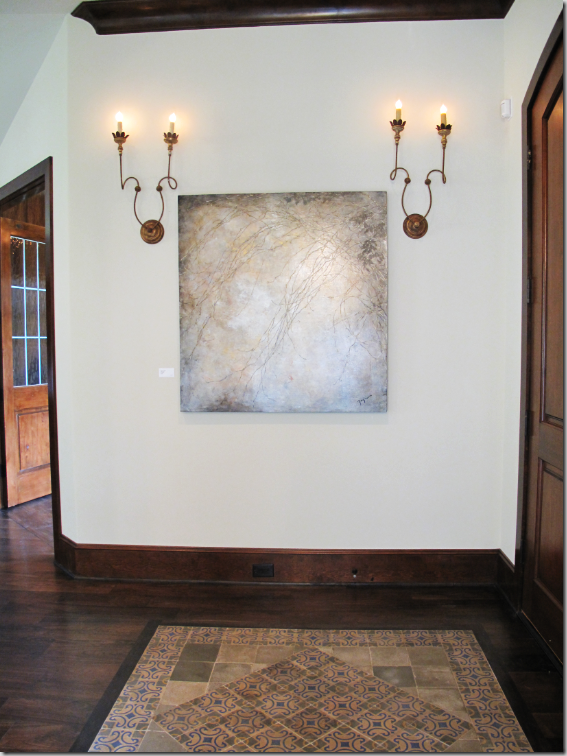
At the double front door, a “rug” of French tiles is laid in the floor. This French tile is seen throughout the house, used in many different applications, thus giving the house its name. Also throughout the house are sconces that provide mood enhancing, ambient lighting.
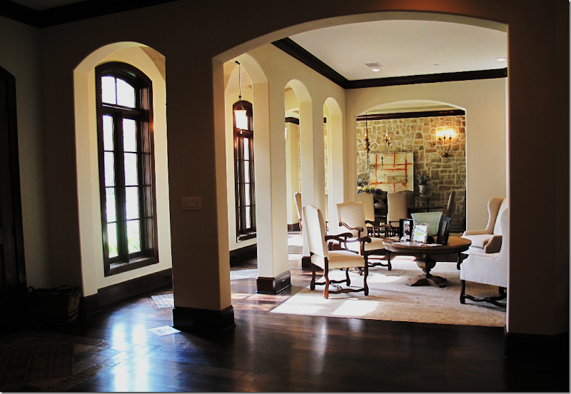
The living room is seen from the entry hall through arches that surround the space on three sides.
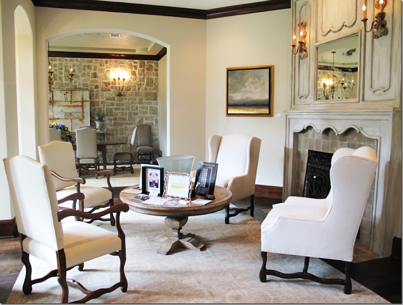
The living room is filled with two pairs of large antique styled chairs with Os de Mouton legs. The fireplace is the focal point of the room.
A close up of the magnificent fireplace.
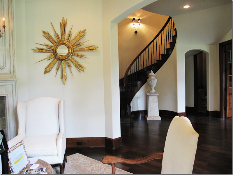
Looking out from the living room to the central stair hall. A paneled library is to the right – and the powder room is through the arched doorway.
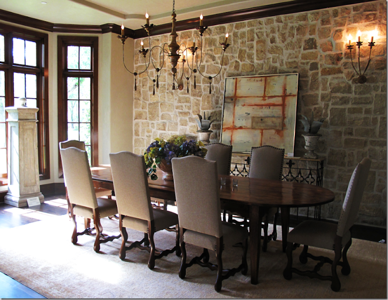
Past the living room arches is the large dining room with it stone accent wall. French chairs surround the wood table and a beautiful Italian wood chandelier with sconces illuminates the area.
To the right of the front door is a paneled study, entered through two wood doors with inset glass.
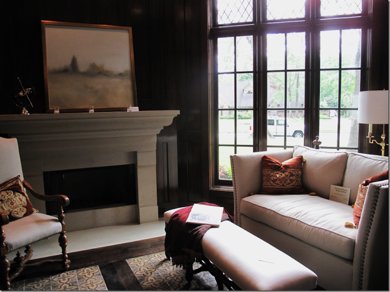
The paneled study is a cozy area with a stone fireplace and a ‘rug” of antique French tiles inset into the wood floors.
In the study, a wall of built in shelves are enclosed behind wire faced doors. All the cabinetry in the house was beautifully designed by Maria Tracy and is quite unique.
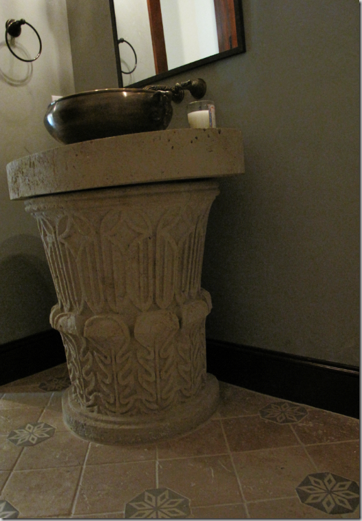
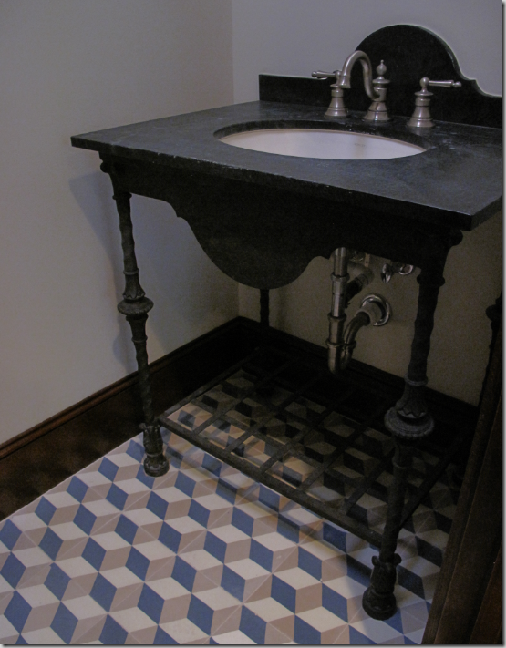
The powder room has a pewter vessel sink atop a limestone pedestal. In this and in each bathroom – the floors are laid with the tiles imported from France.
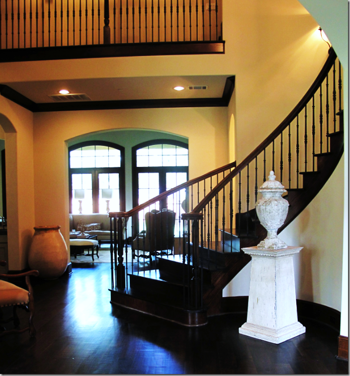
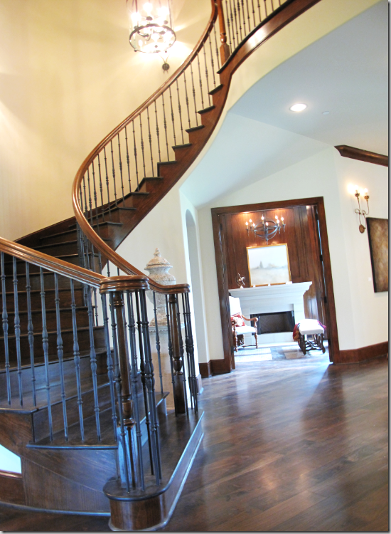
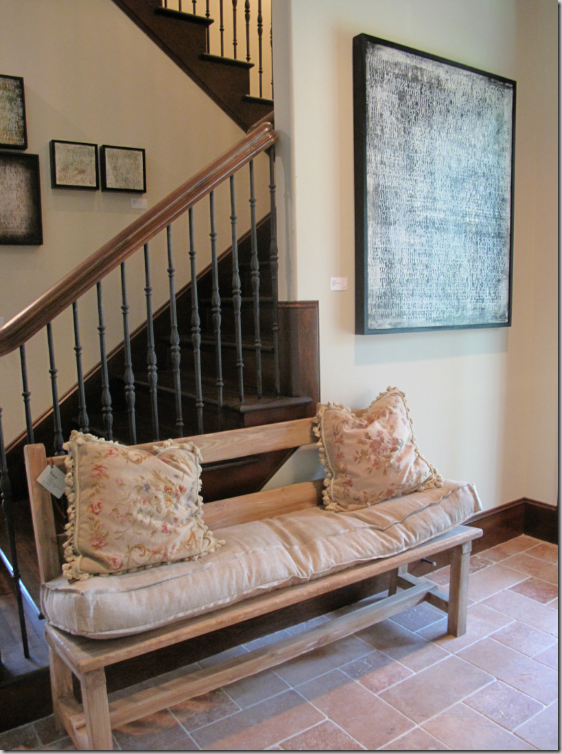
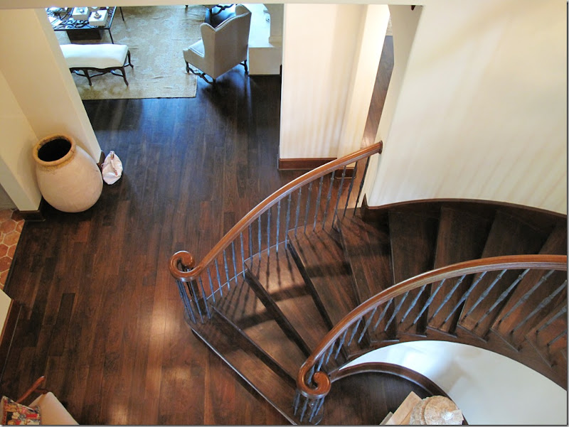
The central stairway with a double height ceiling has a wood banister with iron balusters. This view looks into the paneled study.
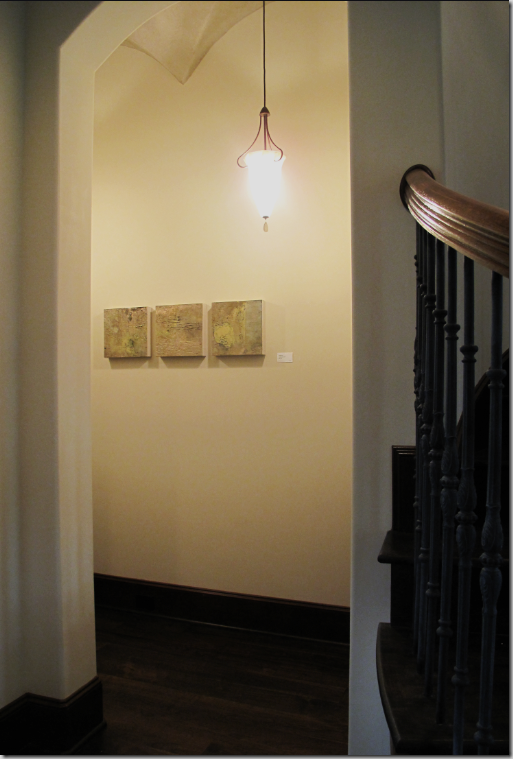
Past the stairway on the right, through a hall with a groin vaulted ceiling is the master bedroom suite.
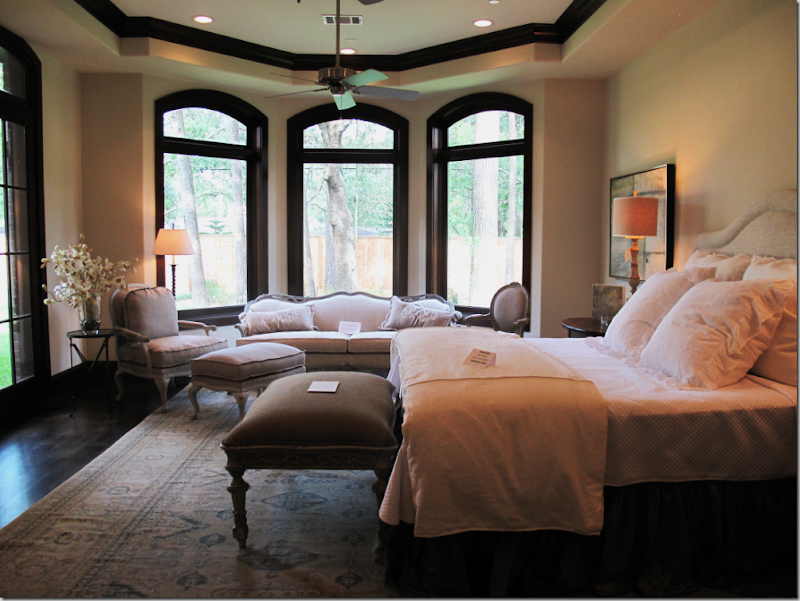
The master bedroom is roomy enough for a sitting area which overlooks the back yard, accessible through the door on the left.
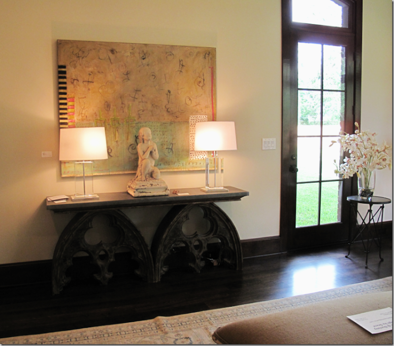
Across from the bed is this vignette with Lucite lamps and large art work provided by the Laura Rathe Art Gallery. All the wonderful art work in the showcase house comes from this gallery.
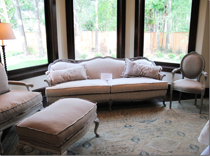
Close up of the sitting area with French styled furniture. The area rugs throughout the house were provided by Creative Flooring.
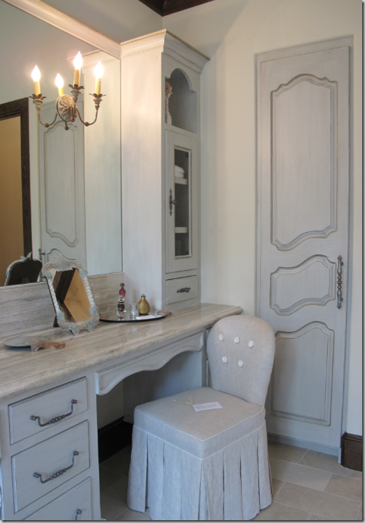
In the master bathroom, a spectacular vanity designed by Maria Tracy is the focal point. Notice the gorgeous curves, the feet, the arched towers – just beautiful! The man’s vanity is reflected in the mirror. All the cabinetry was painted by Segreto Finishes whom you may remember also painted the Octagon House! I love the hardware on this piece – just perfect. Also notice again, there is a large tiled rug in the middle of this room.
The vanities each have French sconces. Notice the charming linen closet door designed by Tracy. Custom Creations provided most of the upholstered furniture in this showcase – just as they did for the Octagon House.
The man’s matching vanity is styled with chicken wire in the cabinet doors which adds to the charm.
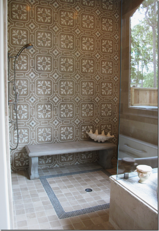
The master double shower has the stunning French tiles installed up its walls. I love the concrete bench placed inside of the shower instead of a built in seat – a great idea to utilize if you have the space!
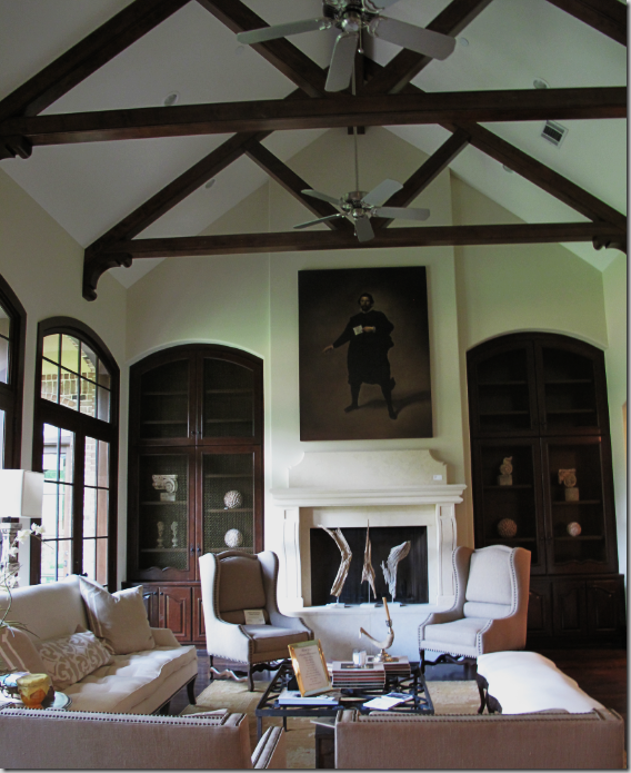
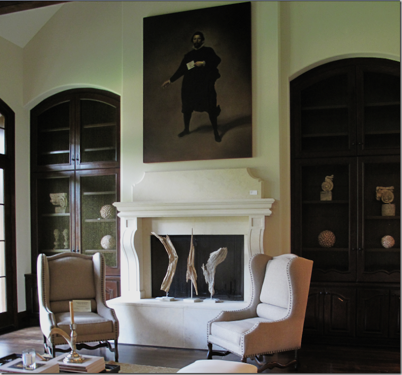
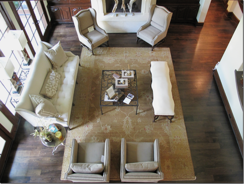
Past the stair hall, along the back side of the house is the large, vaulted ceiling family room. The stone fireplace is the focal point with a beautiful oil painting above it.
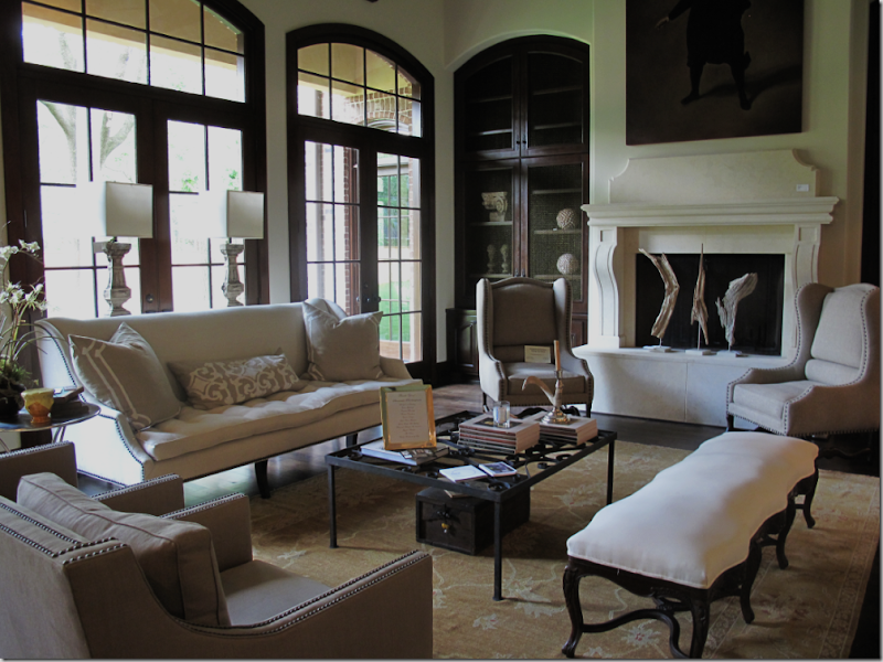
The muted rug and linen clad furniture adds to the house’s neutral palette. Two wing chairs flank the fireplace, while a French styled bench faces the tufted sofa. Iron tables and antique styled lamps finish out the decor.
The French styled cabinetry has doors finished with wire, just as in the study and master bathroom. Touches like this repeated throughout a house provide design cohesiveness. Notice too that many of the built-in cabinets have arched tops – just as doorways in the house are arched. Again – repetition of a design element makes it that much more powerful.
A view of the family room from a second floor balcony.
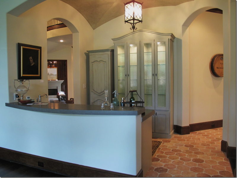
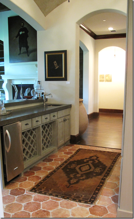
Facing the family room is the groin vaulted ceiling walk-in bar with French terra cotta tiled floor. Through the left arch, you can see the stair hall and into the paneled study. To the right – the bar leads to the kitchen and dining room. Notice the wonderful cabinetry, again designed by Tracy and painted by Leslie Sinclair, owner of Segreto Finishes.
Inside the bar looking out towards the family room. To the right – you can see the hall that leads to the master bedroom suite.
Leading from the bar is a pantry with the dining room on the left and the kitchen towards the right. Notice the gorgeous hardware on the beautiful wooden doors!!!
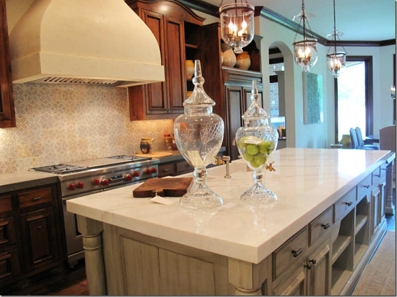
You can reach the kitchen from the bar or from the family room. The kitchen is a gorgeous collection of finishes. White Calacutta Ora marble covers the island, painted gray by Segreto. The imported French tile forms the backsplash behind the range with its large Venetian plaster hood.
The kitchen from the opposite side – towards the left is a china cabinet and at the back is another built-in with mirrored arched doors.
The built in china cabinet with wired doors and arched top. Wire and arches – two design elements found over and over again, giving the house its certain atmosphere.
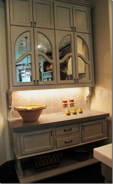
Close-up view of the built-in along the back wall. The doors are arched and mirrored. All these kitchen cabinets with different styling and finishes is so much more interesting that just a bank of cabinets that all look alike. Again – another great tip to incorporate into your own home – mix up the kitchen cabinetry!
Close up of the island with its gorgeous Calcutta Ora marble countertop and a close up of the French tiled backsplash. The kitchen is open to the breakfast room and the mud room, through the arches.
Two styles of chairs surround the wood table. Just charming! Notice the iron chandelier is oval – just as the table is. Details, detail, details!
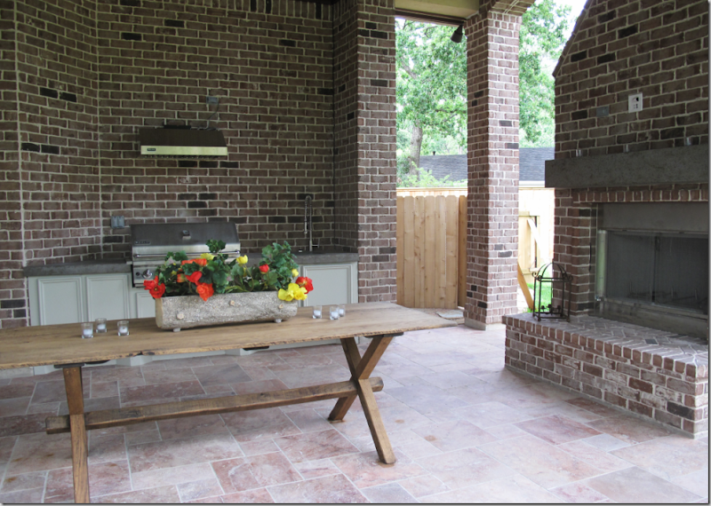 Outside the breakfast room is a large outdoor kitchen with a fireplace.
View of the back of the house. The master bedroom suite is on the left, the family room is behind the three sets of French doors, and the breakfast room and kitchen are behind the windows on the right.
Past the kitchen and breakfast room is the mud room – with more outstanding cabinetry.
A second set of stairs in the mud room leads upstairs - there is also a elevator shaft in the house.
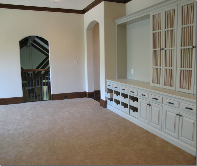
The upstairs wasn’t furnished, but I want to show you the highlights – in this TV area, with a balcony overlooking the family room, the cabinetry has cloth instead of the wire found downstairs, another great idea! The cloth was simply stapled into the doors – the staples were then covered with gimp.
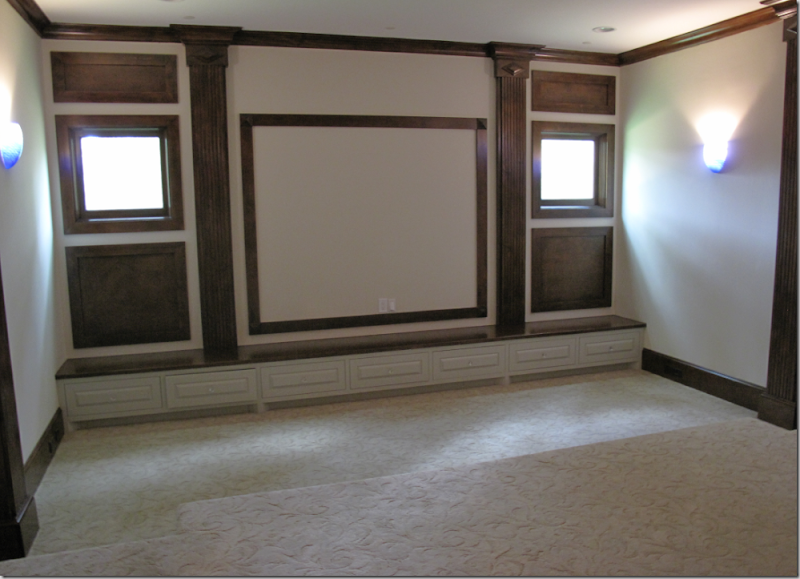
The movie theatre is upstairs. This room is much more sophisticated than the usual theme styled home-theatre typically seen.
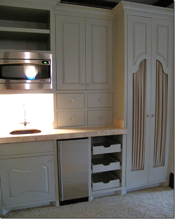
The theatre has a small kitchen area – again, I love the cabinetry designed by Maria Tracy!
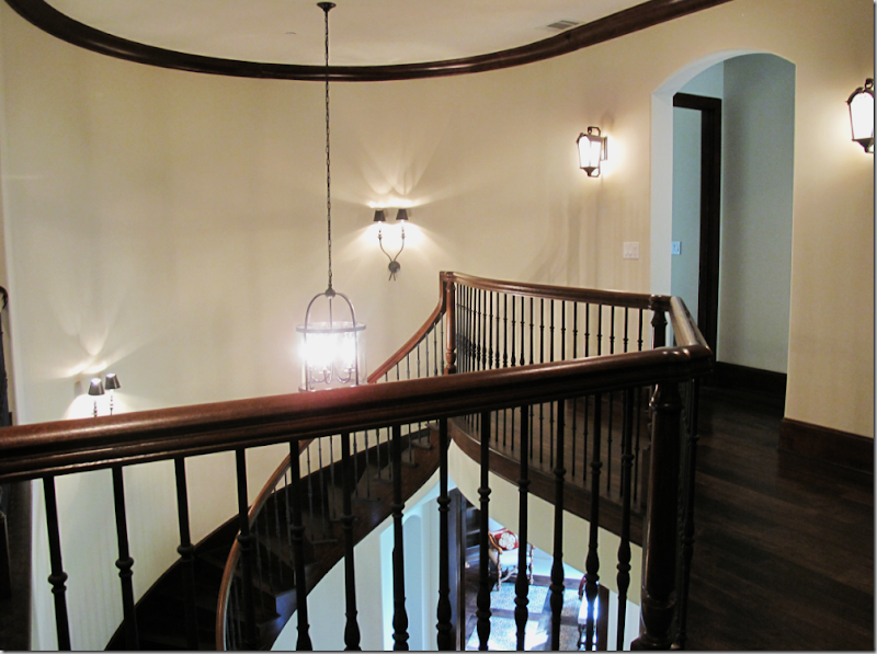
The stair landing on the second story. You can see downstairs into the paneled study with its tile rug!
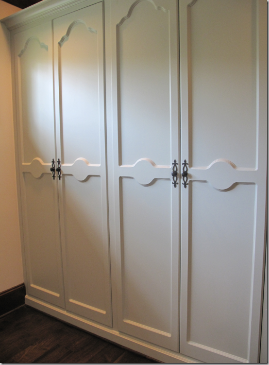
Upstairs, more charming cabinetry designed by Maria Tracy.
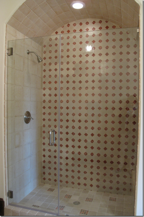
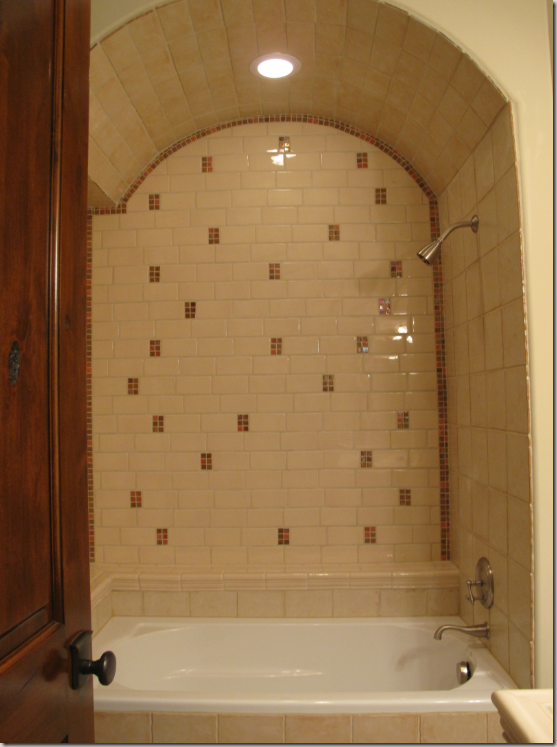
Each of the five bedrooms upstairs has an attached bathroom and all are designed with the French imported tile. This shower, with its arched ceiling – has red and cream tiles. The tiles were all custom colored by Ms. Tracy.
This bath tub, also with an arched ceiling, has cream subway tiles with red accents.
This charming powder room outside the theatre has wonderful marble detailing in arched shapes. The floor is blue, cream and taupe colored French tile.
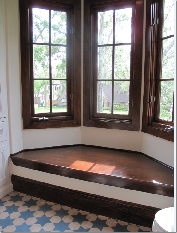
This charming upstairs bathroom was my favorite one – could it be the Jewish star shaped tiles? Or is it the wooden seat under a trio of casement windows set in the front bowed window?
Bathroom Diva!!! Love those hips! Shake ‘em baby!! God, I need to go on a MAJOR diet!!!!!!!!!!
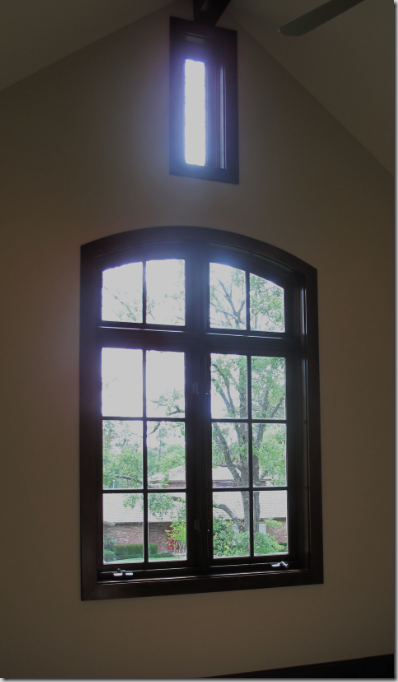
The second floor is filled with bedrooms, bathrooms and flex spaces. Each room has interesting detailing like this vaulted ceiling with casement windows. Other areas have rooms reached by a series of steps. All bedrooms have wood moldings and each has an attached bathroom. Upstairs are five bedrooms, five baths and two half bathrooms.
Going back downstairs, my white purse awaits me. What a beautiful home – so tastefully designed! What torture to now have to go home. I think I’ll drive around the neighborhood for just a bit more torture.
The floor plan to The Tile House. The house is for sale – it is 8,500 sq. ft, the lot size is 22,610, slightly bigger than my typical West University lot of 5,000. To see the listing go here. Visit the builder, Crawford Renovation here and to see Maria Tracy’s web site, filled with pictures from her portfolio, please go here. Thank you Maria so much, for inviting me to see this beautiful house.
Let’s drive around the neighborhood: The entire area where the house is located is called Memorial. Memorial is made up of houses either in the city of Houston or in separate villages – there are five Memorial villages in total – each with their own police department. This house is located in the City of Hunters Creek Village, one of the wealthiest places to live in the United States. Lots are enormous, huge, or large. Some areas of Memorial are very rural and country-like with lanes instead of streets. Others are more traditional neighborhoods. Buffalo Bayou runs through Memorial, feeding its extraordinary lush, forest like appearance. Some areas have lakes, man made from damned up parts of the bayou. The oldest houses are closer to town, the newer ones are further out. But, like many parts of the country, the older houses are being torn down, replaced with huge Mac Mansions and spectacular custom built homes. Needless to say, Memorial, and Hunters Creek in particular, is a very sought after and highly desirable place to live.
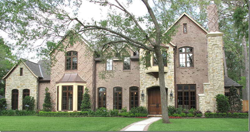
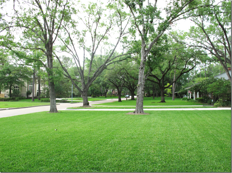
The front yard of The Tile House. This neighborhood was probably built up during the 60s and early 70s. The smaller homes are being torn down and replaced with larger houses – like The Tile House. Streets in this neighborhood have curbs, but no sidewalks.
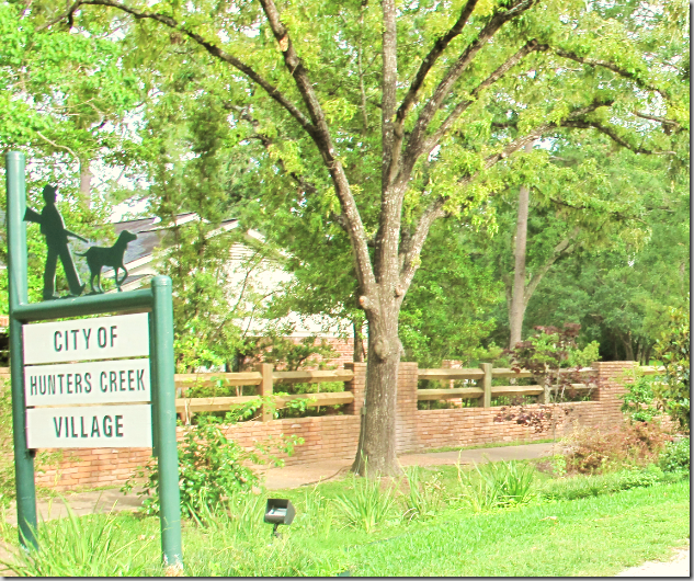
The Tile House is located in one of the “villages” of Memorial – the City of Hunters Creek Village to be exact. Notice the village’s brand – a man hunting with his dog – reflecting the earlier, rural atmosphere of Memorial.
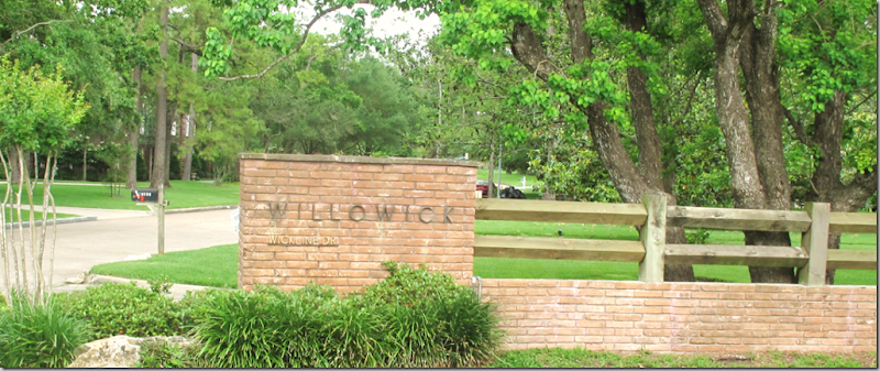
The Tile House, located on Wickline Drive in the Willowick neighborhood in The City of Hunters Creek Village in the area of Memorial in the city of Houston! Got that?
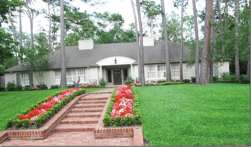
Original houses in this neighborhood are typically ranch style. All have fabulous landscaping and curb appeal.
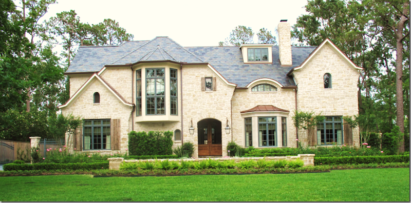
This house, similar in size and style to The Tile House replaced an older ranch burger house.
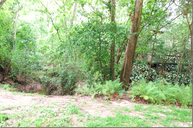
A portion of Buffalo Bayou runs through Willowick – you can barely see its beautiful brown water on the left. The house on the right has built a deck to take advantage of the “view.” Houston, flat marsh land, has little of natural interest – so the bayous have become our treasures. Some treasure, you are probably thinking?!!! Homes with a bayou view are much more expensive than neighboring ones without.
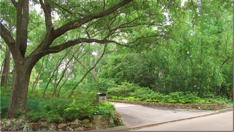
This house next to the bayou can’t even been seen through the thick foliage.
A rare contemporary home in Willowick – an original home - updated and very well maintained. A house in this kind of condition will never be torn down most likely.
And last, this home in Willowick is much more typical than the contemporary one – a true plantation style home, painted white with black shutters. It doesn’t get any more Southern than this!
I hope you have enjoyed this tour through Willowick in Memorial. If you are interested in seeing The Tile House, contact the listing agent here. And, please be sure to visit Maria Tracy’s web site here.














No comments:
Post a Comment